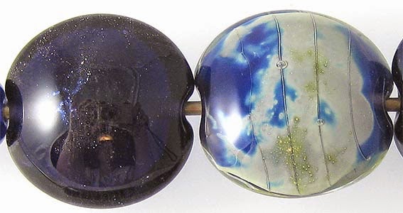
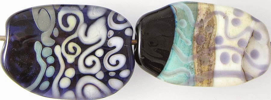
1 - Plain, 2 - Plain (reduced), 3 - w/ Silver Leaf, 4 - w/ Silver Leaf (reduced & encased), 5 - w/ Reducing Silver Glass Frit, 6 - w/ TerraNova2 Frit, 7 & 8 - w/ Tuxedo, Copper Green, Opal Yellow, Ivory & Peace
Effetre Dark Violet Transparent is a nice, dense transparent colour by Effetre standards, and if you use it in a solid-coloured bead, the resulting bead looks almost black. However, in thin layers, Dark Violet isn't really all that dark at all. If you use it over Ivory or White, it is actually a little washed out, so if you are using it in layered designs, I recommend using a more colourful colour under it (e.g. Pale Pink, Pale Blue, or Pale Purple opaque glass) that has something of its own going on in order to get a more vibrant result.
Dark Violet is reactive, both with silver and other colours, in an interesting, subtle way.
Here you can see that in the bead where I used silver leaf on top of the Dark Violet and just melted it in, the silver all but disappears. When the silver is reduced and encased, it turns silvery and metallic under the clear, but more interestingly, it fumes the base glass next to it so that it is cloudy and a vibrant blue colour.
Silver Glass reduction frit is pretty nice on top of Dark Violet. I really like the way my frit blend worked out on top of it in the bead on the left.
In the bead on the right, I got some strike from my TerraNova2 frit, but it didn't really pop. As usual with this test, don't read too much into it. I do this to find the bases where silver glass effortlessly blooms and Dark Violet is clearly not one of those colours, but that doesn't mean that someone more skilled at striking it than me couldn't get good colour out of it on top of Dark Violet.
I didn't get much in the way of reaction from Tuxedo. I almost never do with transparent colours.
Copper Green, Opal Yellow, and Peace all separate on top of Dark Violet. Copper Green also separates when Dark Violet is used on top of it, but Opal Yellow and Peace don't seem to. They do, however, both act sort of strangely. You can see in the bead on the right that the Opal Yellow has developed a huge number of purple freckles, obscuring for the most part the dots and lines I drew. I think this is the Dark Violet breaking up on top of it, but it's hard to be sure. In the case of peace, there is a weird crack-like separation line developed between the Ivory and Peace. This has never happened before, so I want to blame it on the Dark Violet but don't really see a way to do that when it is only happening where the Peace meets the Ivory. That reaction is a bit of a mystery.
Ivory spread and curdled on top of Dark Violet. In the bead on the right, Dark Violet seems to have developed a dark line in the middle of the stringer lines I drew, and the Ivory around it looks flecked with pale purple.
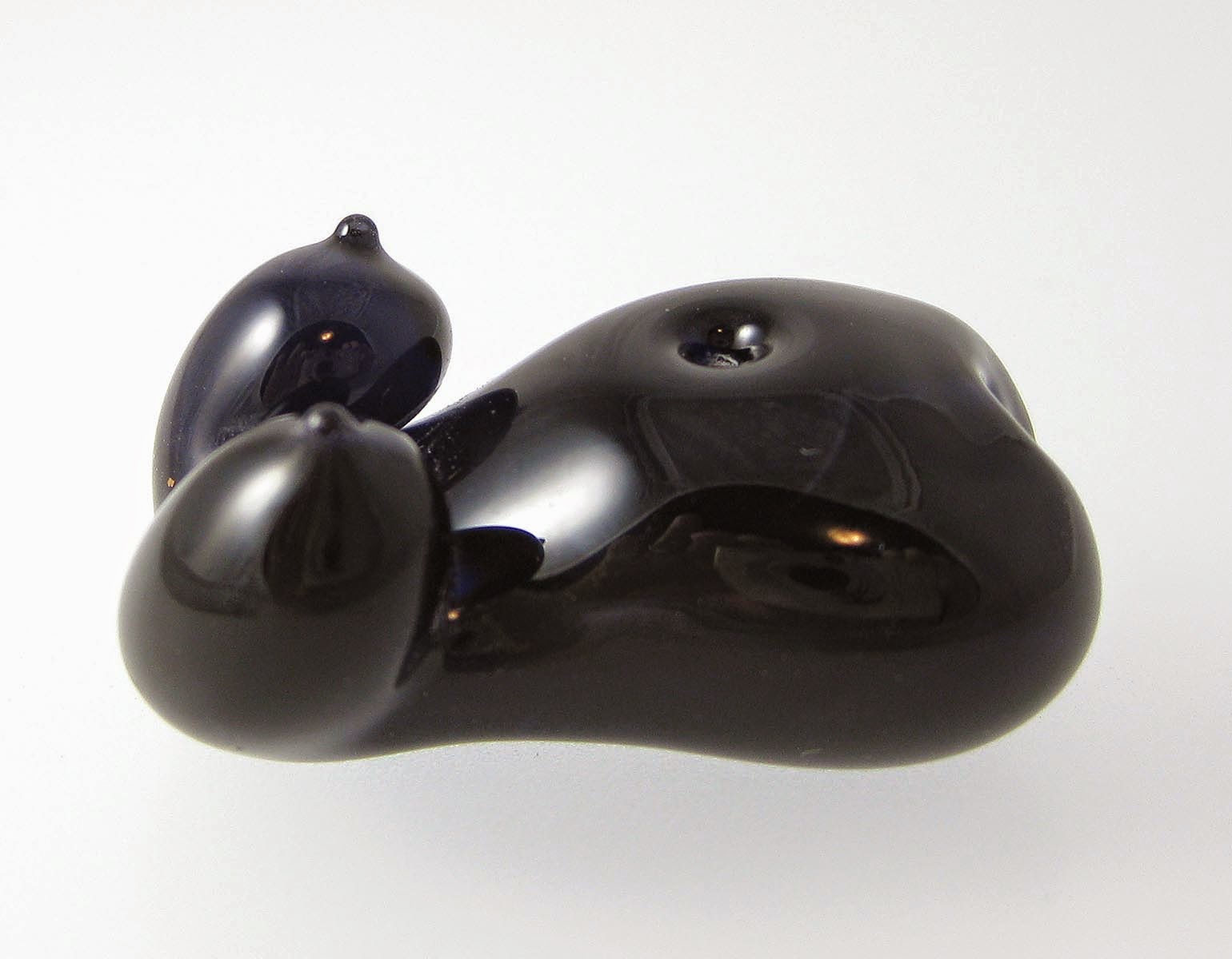
Here is a goddess bead made from Dark Violet. You can see how very dark Dark Violet is when used in sculptural way.
These beads also use a little Dark Violet.


No comments:
Post a Comment